
Sugo Media set up shop less than a year ago – and we’ve already been through three redesigns.
It’s crazy. We’re the first to admit it. But we also think we’re better for constantly re-evaluating our branding, and we think our latest iteration is a winner.
We had a lot of ideas when we finally landed on the name Sugo Media – we thought the story behind the name would resonate with other small business owners, because they’re as passionate about what they do as we are about media, just like our founder’s grandmother was passionate about cooking.
The word sugo is Italian, so we thought the most effective branding would be evocative of the style of food posters from the 20s and 30s.
The typical colors were bold, most often featuring yellow, red, and black. There was a lot of negative space in the images, and the illustrations were evocative and sometimes a little surreal.
Video production is one of our focuses at Sugo, so we took several photos of an old Kodak Brownie Super 8mm camera we have, and processed it in Photoshop to look more like a grainy illustration. Since cooking is a central idea to our backstory, and tomatoes are not only a staple of sugo but Italian cooking, we incorporated a tomato into the lens of the camera.
We decided to use a blue/red/orange color scheme because those colors convey creativity, and a black/yellow/red color scheme from the Italian posters may be too harsh and off-putting for new viewers.
After a few tweaks, we ended up with this as our website header (“Sugo Media” appeared in the upper left corner of the site, in the typeface you’ll see in the next example):

This was okay, but after having a few business cards printed off with this logo on the back, and seeing this every time we looked at our site, we decided that the blue looked a little too drab and that the image didn’t really pop. It didn’t make a whole lot of sense, which was okay, but it wasn’t striking. That was a problem.
So we went back to the drawing board. After some hand-wringing, we ditched the camera-tomato logo. We didn’t think the influences were obvious in our execution, and if the branding had to be explained to people it wasn’t worth keeping.
Our next iteration kept the tomato and put it in a square, on top of the ‘Sugo Media’ text. We also brightened the blue to a more cheery shade, and found the blue/red/orange color scheme looked a lot better.
This is the title card we used at the end of many of our videos, and used a similar theme on the website and on our stationary (including some postcards we posted in local coffee shops):

This was a big improvement from where we were at, and we thought it worked well enough. But still, the design was a little unconventional and the influences weren’t particularly obvious, especially with the typeface we’d been using for our name. The layered lines of the text look visually interesting, but we started to feel it still wasn’t evocative of those Italian posters we loved so much. Instead, it looked a little more post-war 50s, which wasn’t bad, but not what we wanted people to associate with our brand.
We’re a small and young company that values compelling visuals and tries to keep up with the most interesting trends in the design world. Our logo was closer to reflecting that, but it wasn’t there.
So we scrapped the entire logo, and we started over.
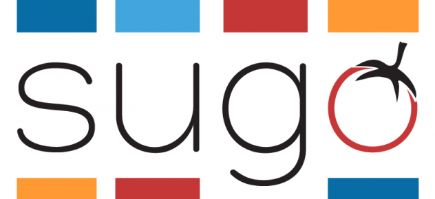
We decided to forget the Italian poster visual style. We hadn’t really nailed the aesthetic, and were afraid we were squandering our first impression. We did want to keep our color scheme, and had long thought incorporating the tomato visual into the “o” of “Sugo” would be a striking touch.
We came up with a modified color scheme with two shades of blue, a more festive orange, and a brighter red. The text is not a full-bore black, instead it’s slightly dialed back to a dark charcoal shade that isn’t as severe.
After reviewing and comparing dozens and dozens of typefaces, we decided on the sans serif typefaces Hero and Hero Light as they were clean and modern, without being too familiar. We sketched several version of stem and leaves to turn the “o” into a tomato, and after some coaxing from trusted friends, we committed to making the “o” red in all but the smallest versions of the logo.
That’s how we ended up with this:

This is the current image at the top of our Facebook page, and you’ll see various iterations of the logo, sometimes in a light blue box, and sometimes surrounded by blue, red, and orange boxes, throughout our website and social media.
It took a lot of reflection and honesty to come to where we are today with the Sugo Media branding, and we’re very happy we did.
In fact, we like our newest logo so much, we may stick with it for almost a year.